When leading products you will find yourself balancing the scarcity of time, budget, and capacity against a probably too large and growing list of potential features. Other stakeholders and you can always have opinions of what matter most and what deserves more attention. That is why it is important to embrace a method that allows you to separate emotions from facts and that at least attempt to quantify your intuition.
There are a multitude of documented methods to approach prioritization. Among the most popular we find
- Value vs effort
- Kano model
- Story mapping
- RICE
- Buy a feature.
- Cost of delay
- Opportunity scoring
- Story mapping
In my experience, there are benefits of combining multiple approach if you end up with a visualization that can support a thoughtful discussion and a data-based decision. Here are the steps that I had followed in the past.
List your considered features.
You need to start by defining the universe of features that you will be evaluating. Beyond being obvious for this exercise, it is also a good reminder that this list needs to be known and accessible for all stakeholders.
Feature vs current context
Time matters, specially where you are right now and what you know it is needed next. The product team and stakeholders should be able to establish if a given feature is critical now, should not be embrace now or something in between. Taking from the MoSCoW method, we can use:
- “Must-have” for those features that are essential.
- “Should-have” for those that are important and time-sensitive.
- “Could-have” for those that we know we can live without, even if they are important or relevant.
- “Won’t-have” for those that right now we know we will not embrace.
The MoSCoW method is a little bit more assertive about the non-negotiable qualification of the “Must have” but in this case we want to remain more flexible. The beauty of this classification is that it is prone to evolve as time passes, allowing those “Won’t-have” to get back in the game or reducing the urgency of higher qualified features.
Measure the consequences of not implementing a feature.
Cost of waiting is a great measure to understand what is on the line if we do not get a feature done. It is a more grounded version of trying to measure the potential revenue benefits of new feature. It also allows to uncover some actual data that could be impacting in sales or forecast for features that might had been socialized with customers or are tighten to a market opportunity.
Measure how much do you really know about the impact of a feature.
Ideally you have test results and actual factual data that allow you to be assertive when it comes to expressing the potential value of each feature. But you will not always have all the information you should have and there are some gut feelings involved in the valuations. Using the RICE model as reference, add a measure of the “Confidence” you have about the data that is available with simple values as “High”, “Medium” or “Low”. This will later allow us to favor those features where more research had been done and facts are available.
Quantify how large is the impact.
Again from the RICE model, I like to surface who will be impacted and how large is that pool. This is usually measured in customers or users, but we could also be centered in transactions or records. As it is a number, it will be important to agree to a standard measure across all features.
Calculate the impact of the feature.
The RICE model suggests using an “Impact” measure, but I feel this may not be detailed enough and prone to allow more subjectiveness in the exercise. I prefer to us a weighted approach to try to document what is “impact” really composed of. Use something between discreet number of concepts like “increase revenue”, “customer value”, “strategic value”, etc.… in a weighted model to aggregate what is actually “Massive”, “High”, “Medium” or “Low” impact
Surface effort and complexity
Some models like to use time to understand what is involved in implementing a feature. I feel that does not bring enough information about the complexity to get the job done. I prefer to represent effort as the sum of all the related story points. I can easily translate that to time using the team velocity and I feel it better represent the challenge that the engineering team needs to undertake.
Aggregating and visualizing the model.
With all this information gathered, we are going to be aiming to represent it to allow us to understand:
- Value of the feature vs the effort involved to complete it.
- Current context vs cost of not embracing it.
Effort is something that at this point we had already aggregated.
Value would come from getting a score by multiplying reach by weighted impact and factoring our confidence in our data.
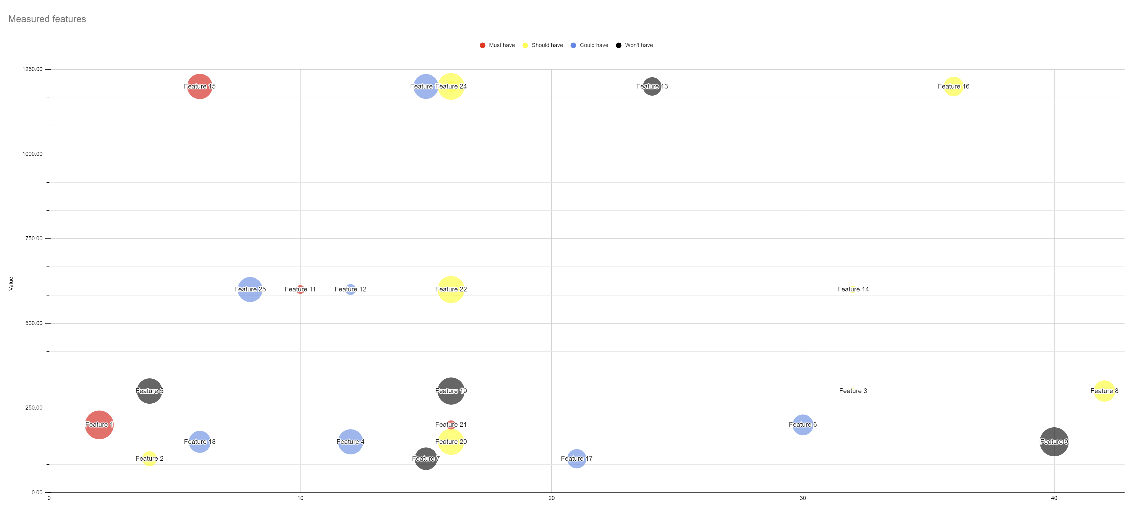
My preferred representation is a bubble chart, as a I can use effort in the X axis and value on the Y-Axis. Cost of waiting would define the size of each bubble and the color scheme would tell where each feature is regarding the current context. It is a very informative representation as it allows to easily identify:
- High value and low effort features by looking in the upper left quadrant. Those with “Must-have” and “Should-have” would be highly prioritized.
- Low value and high effort features by looking in the lower right quadrant. Those with “Should-have” might need to be evaluated considering the cost of waiting and the “Could-have” are strong candidates to move them to “Won’t-do”.
- High-cost features with low values by looking at the lower half. The bigger bubbles in these areas need to be carefully reviewed to understand why something with such high cost are not ranked with higher value. Ideally no high-cost feature should exist in this area and if so, then the weighted impact model may need to be revised.
- High value, High effort and High-Cost features looking for big bubbles in the upper right quadrant. These are most likely those features that become their own strategic initiatives and would benefit from breaking it down to make them more affordable to embrace and make progress towards reducing the cost of waiting.
At the end, these models are meant to support the decision-making process and the related conversation. But a data driven and structured process to support the decisions allows for a more objective rationalization of which are the right features to invest in.
I created a spreadsheet, using google sheets, with this model. You can get it here. Feel free to use it and improve it!
This post has been published on www.productschool.com communities